

PaymentAccuracy.gov Website Modernization
PaymentAccuracy.gov is a gateway into Federal spending of taxpayers’ dollars. It gives data-driven insights on how Federal agencies are progressing in the prevention and recovery of improper payments while ensuring that the right individuals and communities are benefiting from Federal funding.
Our high-profile stakeholders came to us with one very large and urgent request: an entire overhaul and modernization of PaymentAccuracy.gov.
Client: Office of Management & Budget (OMB)
Work: PaymentAccuracy.gov Website Modernization
Design Tools: Figma & Adobe Illustrator
My Role
I am a UX/UI and Visual Designer working to overhaul and modernize PaymentAccuracy.gov. I led the creative vision and product direction for PaymentAccuracy.gov and my work included:
Design Strategy & Ideation
UX Collaboration
Visual Design
Data Visualizations
High-fidelity Mockups
Interactive Prototypes
Discovery
The Problem
To put it plainly, the current PaymentAccuracy.gov site is outdated and an eye sore. The current site has cluttered and content-heavy layouts, confusing navigation, and lack of a visual hierarchy.
UX Gathering
Our client was very eager to start the design process and development of a new website that told a powerful story about Federal agencies improper payments and their reduction and recovery of improper payments. During an hour-long recorded UX gathering session, we discussed the client’s concerns about the current website, it’s layout, content, and data visualizations, which allowed us to quickly identify and prioritize pain points:
Top 3 Client Pain Points:
Clients highly disliked the content design of the entire site.
Clients felt that the site’s information architecture was confusing and difficult to navigate.
Clients found that the site lacked effective data visualization that showed trends over time.
Design Challenge: To create a simplified, clear, and intuitive data-driven website that enhances the user’s understanding of Federal spending of taxpayers’ dollars.
Design Strategy & Ideation
After prioritizing client pain points, it was time to strategize and ideate on design solutions.
Client Pain Point #1: Clients highly disliked the content design of the entire site.
Design Strategy: The original content design for the Federal agencies and program pages displayed in a tableau-like dashboard with a continuous scroll. Further, each content section within the dashboard displayed in separate containers, and if the content exceeded the dimensions of the container, users had to hover over the container for an overlay to appear with the entire text…Yes, it was very confusing (pictured below).
While the Federal agencies and program pages were very content-heavy, we did not have the option to reduce or rewrite the content as it was apart of the Federal reporting requirement. It was also understood that a lot of this content was not read by users unless it was of particular interest to them. This knowledge led us to design consistent agency and program page layouts where interactive data visuals appeared at the top of the page, followed by accordions with clear headers. Accordions gave users control over expanding/collapsing the information most relevant to them as well as, simplified content-heavy pages and limited page scrolling.
Image: Federal agency and program page displayed in a tableau-like dashboard with a continuous scroll.
Image: Mouse hovering over ‘Executive Summary’ content to reveal an overlay of the entire section’s text.
Image: Redesigned Federal agency page with collapsed accordions.
Image: Redesigned Federal agency page with snapshot of accordions expanded.
Client Pain Point #2: Clients felt that the site’s information architecture was confusing and difficult to navigate.
Design Strategy: One of our client’s largest frustrations was how the content was organized across the site. There was no intuitive arrangement of the site’s information. For instance, if user’s wanted to search for a specific Federal agency’s improper payments data, they had to click on a vague navigation description titled, ‘The Numbers’ and then click on the ‘Agency’ dropdown hidden in a tableau-like dashboard.
We immediately recognized that we would have to overturn the entire information architecture of the site. Through our UX gathering session, sitemap, and internal design discussions, we came to the strategic decision to breakdown and consolidate the website’s content into 3 main sections:
Government-wide Spending. This became the website’s homepage. The homepage gave an overview of ‘Government-wide Spending Trends,’ and ‘Top Performing Agencies’ and ‘Declining Agencies’ in meeting targets for the reduction and recovery of improper payments.
Agencies & Programs. This is the Federal agencies & Program’s landing page. Here, users are able to view all Federal agencies and their programs in a data-driven table that allows for a quick glance at how Federal agencies are doing in terms of their ‘Total Spent in Federal Funding,’ ‘Total Susceptible Programs,’ ‘Total High-priority Programs’ etc. The Federal agencies and programs in the table link to their respective profile pages. The prominent page search bar also allows users to quickly search the table for a specific agency or program profile.
Resources. The resources page provides user’s with information about the data found across the site, external data resources, Federal legislations, and frequently asked questions.
Image: Paymentaccuracy.gov homepage mockup highlighting Government-wide Spending trends.
Image: Agencies and Programs landing page mockup with table listing all Federal agencies and their respective programs.
Image: Resource page mockup displaying downloadable datasets, data resources, and frequently asked questions etc.
Client Pain Point #3: Clients found that the site lacked effective data visualizations that showed trends over time.
Design Strategy: The current site only used complex data tables and no other forms of data visualizations. So, it was very apparent that we had a large opportunity to modernize the data visuals across the site and show data trends. We conducted a thorough site data analysis to better understand how we could transform the data into clear and concise visuals to enhance our user’s experience. We considered the use of line graphs, stacked line graphs, stacked bar graphs, pie charts, and doughnut charts, but ultimately, chose interactive stacked line graphs, doughnut charts, and data tables. A notable feature that I love is how the stacked line graphs allow users to see different improper payment types together in one visual, but also, offers a chart toggle where user’s can view improper payment types exclusively on their own or a few at a time.
Image: Data visualization of stacked line graph with all chart toggles turned on.
Image: Data visualization of stacked line graph with only ‘Payment Accuracy Amount’ and ‘Unknown Payment Amount’ chart toggles turned on.
Desktop-first Designs
Paymentaccuracy.gov receives a majority of its traffic from desktop visitors, so our mockups focused on responsive desktop-first designs that adapted to mobile. This was especially important to consider as we worked with very detailed content and complex data visuals. Throughout the design process, I built logical page layouts using UI components and elements that would translate seamlessly into mobile designs.
The mobile design iterations are not apart of this case study as it was created during phase 2 of product development and I had since moved forward to oversee another design project.
Visual Design
Typically, after design strategizing and ideation, I would begin developing wireframes. However, our client was very eager to start development, so in a short turnaround, we presented several high-fidelity mockups and continued to iterate designs until we presented a final interactive prototype.
I led the creative visual design for paymentaccuracy.gov modernization efforts. While we used the U.S. Web Design Standards (USWDS) UI Component Library to achieve overall design consistency (including typography and color palettes), we also created unique components suitable for our website’s data-driven objectives.
Here are a few noteworthy visual design elements and components:
Data Cards
Our improved data visualizations across the site not only included charts and tables, but also, data cards. Data cards are displayed on the site’s homepage and Federal agency pages. They highlight major data points of interest in an easier way for user’s to process and understand. These major date points included ‘Payment Accuracy Rate,’ ‘Improper Payments Rate,’ and ‘Unknown Payments Rate.’

Image: Three data cards displaying different data points including, ‘Payment Accuracy Rate,’ ‘Improper Payments Rate,’ and ‘Unknown Payments Rate.’
DATA TRENDS
Our modernized site focused on telling a story about Federal spending. We highlighted Federal agencies who are doing well and agencies who are not doing well when it comes to meeting their targets for the reduction and recovery of improper payments. To display this in a fun and meaningful way for users, I essentially created a Federal agency hit list, taking inspiration from music charts (‘Billboard Top 100’) and Nasdaq market trends. The final design displayed a chart of ‘Top Performing Agencies’ and ‘Declining Agencies’ coupled with minimal iconography, hyperlinks to Federal agencies profile pages, and increasing/decreasing percentage signifiers.
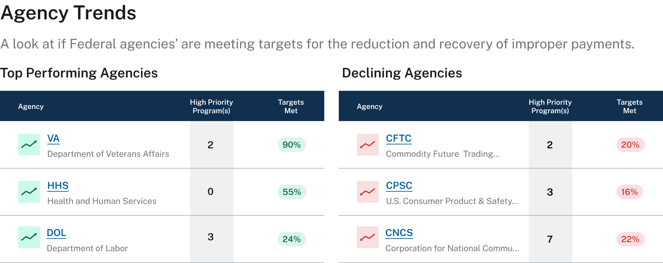
Image: Agency trend tables showing ‘Top Performing Agencies’ and ‘Declining Agencies.’
Graphics
I primarily incorporated graphics on the site’s homepage and inner page banners. I thoughtfully incorporated the use of Federal building stock imagery combined with abstract data visuals. These graphics created visual appeal and an engaging user experience. It helped further convey the purpose of the website and the information found on the site - Data surrounding the Federal Government.


Image: Page banner image for Federal agency pages (this mockup is for the Department of Veterans Affairs).
Page Layout
As mentioned during the ‘Design Strategizing and Ideation’ period, we conducted a complete overhaul of the site’s current content design and created consistent and logical page layouts. The page layouts arranged UI components in a hierarchal structure:
Executive Summary/Description (if applicable)
Data Highlights (data cards)
Data Visualizations (stacked line graph, doughnut chart, and data tables)
Content (headers & accordions)
Please Note: For Federal agencies and program page profiles, we color-coded agencies (purple), programs (green), and high-priority programs (orange). High-priority programs also have a program scorecard section, which we integrated into the design as a tabular toggle between ‘Program Results’ and ‘Program Scorecard’ (pictured below).
Image: Federal agency page mockup for The Department of Veterans Affairs.
Image: Program page mockup for The Department of Veterans Affairs Beneficiary Travel Program.
Image: High-priority program page mockup for The Department of Veterans Affairs Federal Pell Grant Program.
Final Design & Prototype
After a number of design iterations, client syncs, and reviews, we finalized 17 high-fidelity page mockups and an interactive prototype.
Please Note: This video highlights a 6 screen prototype.
The Results
We completed this project under a limited timeframe, which required us to iterate designs and deliver high-fidelity mockups on a weekly bases. Because of increased client pressure to start development, the finalized designs were essentially a Minimal Viable Product (MVP) driven by a design thinking approach, a strong understanding of human-centered design principles and business objectives.
The final designs are currently under development (as of April 2025) and once the new website launches, we hope that real-time user feedback, usability testing, and data analytics will inform future design decisions and improvements across the site.
Final Thoughts
I love leading the creative vision and direction of a product, and this particular project prompted a new challenge for me. It gave me the opportunity to explore and enhance my understanding of data visualizations, an area I only worked in once before during my early years as a designer. Data and numbers can be something very overwhelming and confusing for people, so I truly enjoyed going through the design process and ideating ways to create a data-driven, yet user-friendly platform.
This project also reaffirmed my belief in teamwork and great design collaboration. I collaborated with another UX professional, which ultimately led to great design banter, valuable insights, and innovative design solutions.